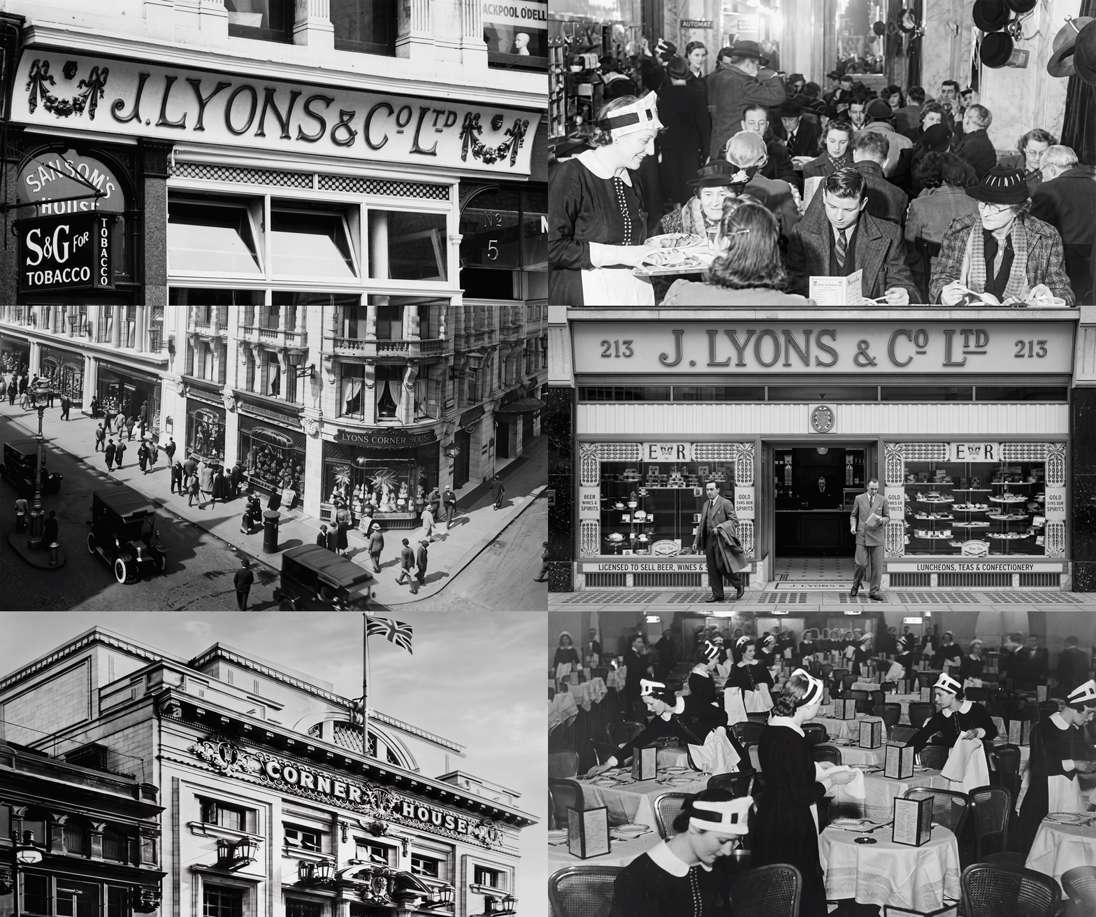
Founded in the late 19th century, Lyons Corner House became one of Britain's most recognisable hospitality brands, renowned for its grand tea rooms and restaurants.
During the 1920s and 1930s, at the height of the Art Deco movement, the brand reflected the elegance, optimism, and modernity of the era through its architecture, interiors, and graphic design.
Lyons Corner House became a symbol of accessible luxury and social dining, making it an ideal brand to reinterpret for a contemporary audience while celebrating its rich Art Deco heritage.
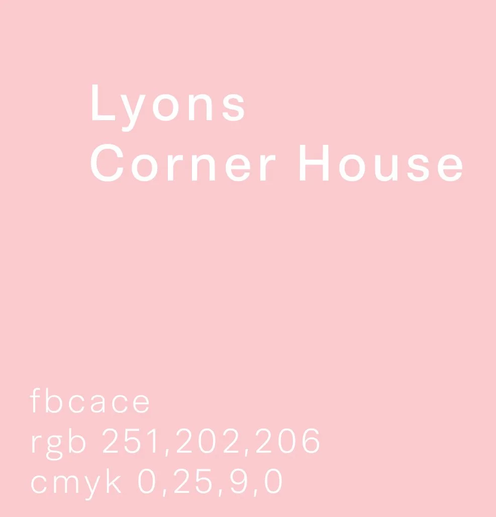
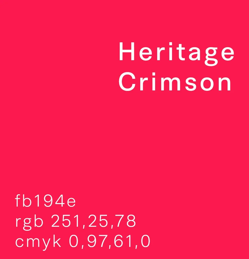
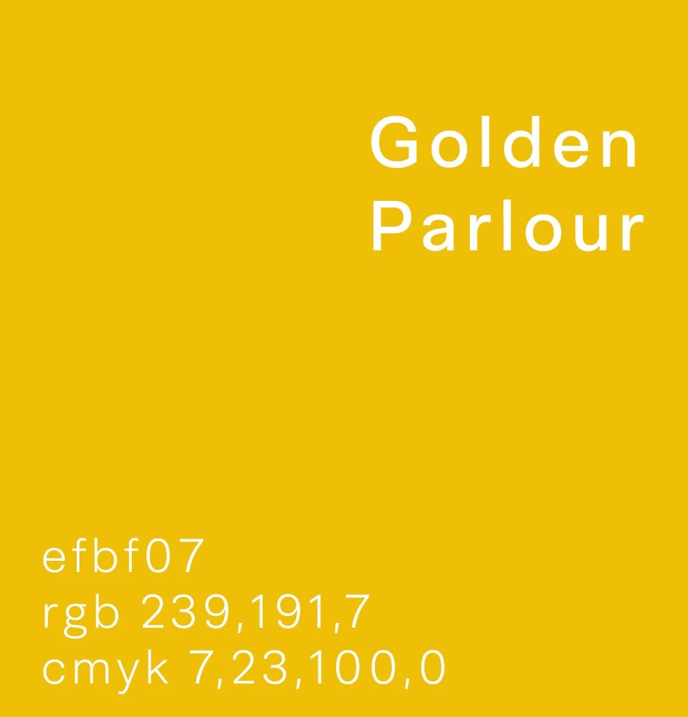
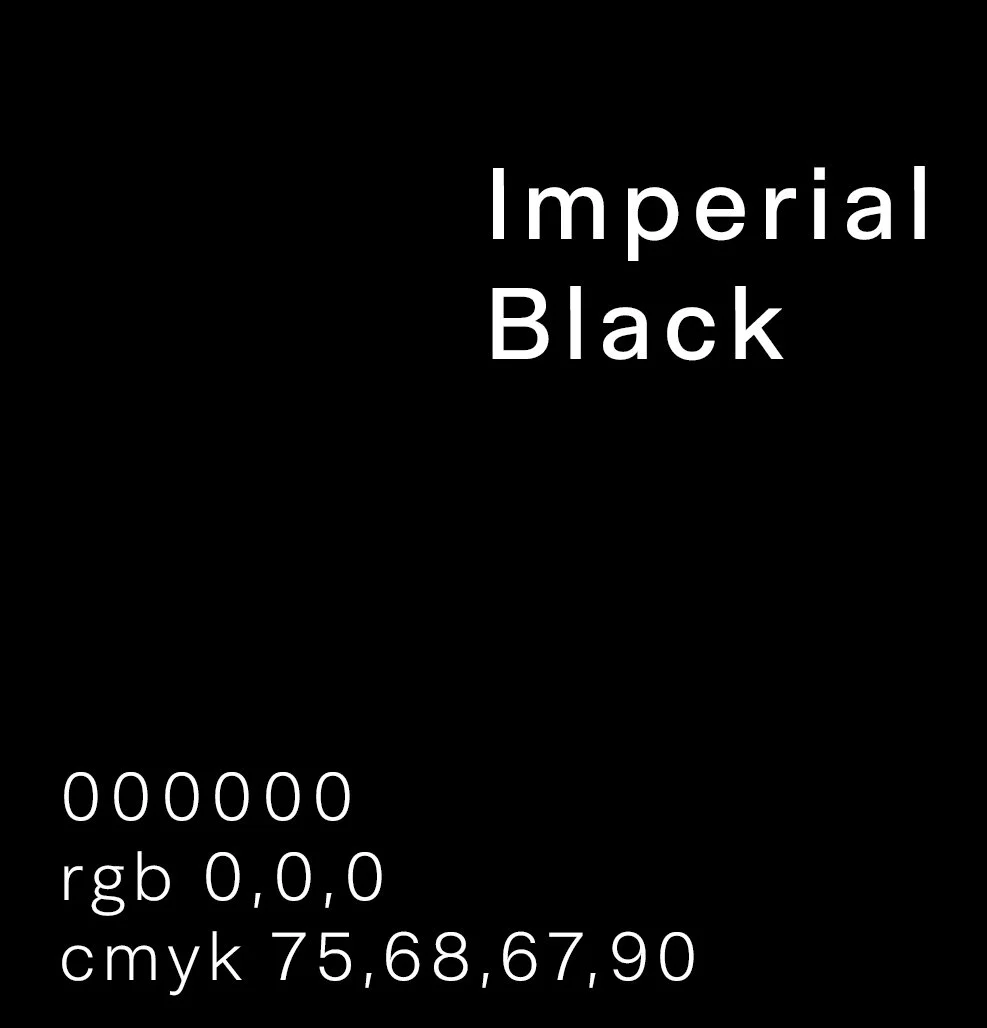
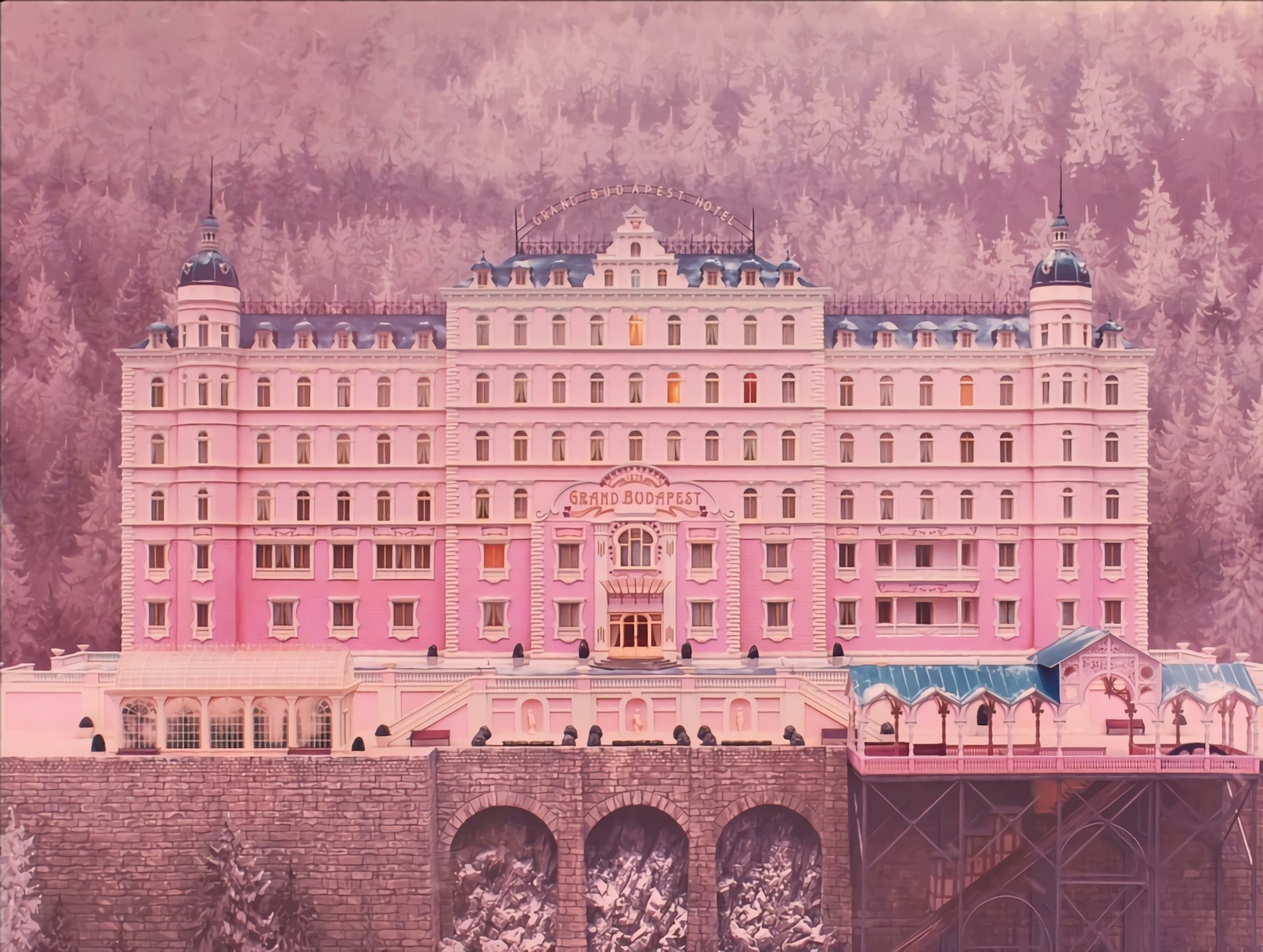
I was particularly inspired by the visual language of Wes Anderson's films, drawn to their soft colour palettes, meticulously composed scenes, and sense of visual spectacle. The symmetry, elegance, and understated luxury found throughout his work resonated with the vision for reinterpreting the Lyons Corner House brand.
These cinematic qualities provided a contemporary lens through which to celebrate the brand's Art Deco heritage, creating a visual identity that feels both nostalgic and modern.
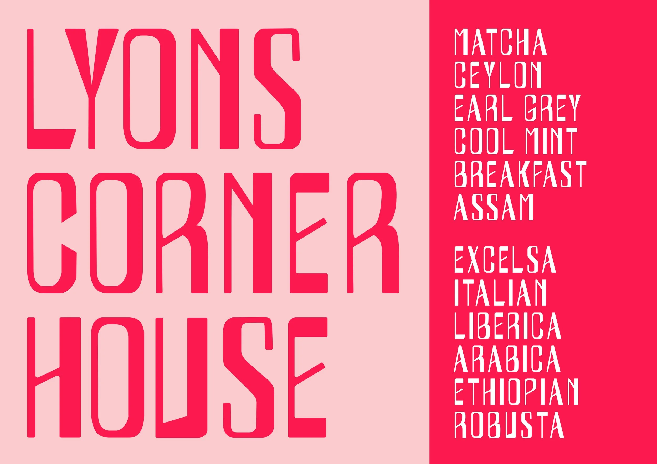
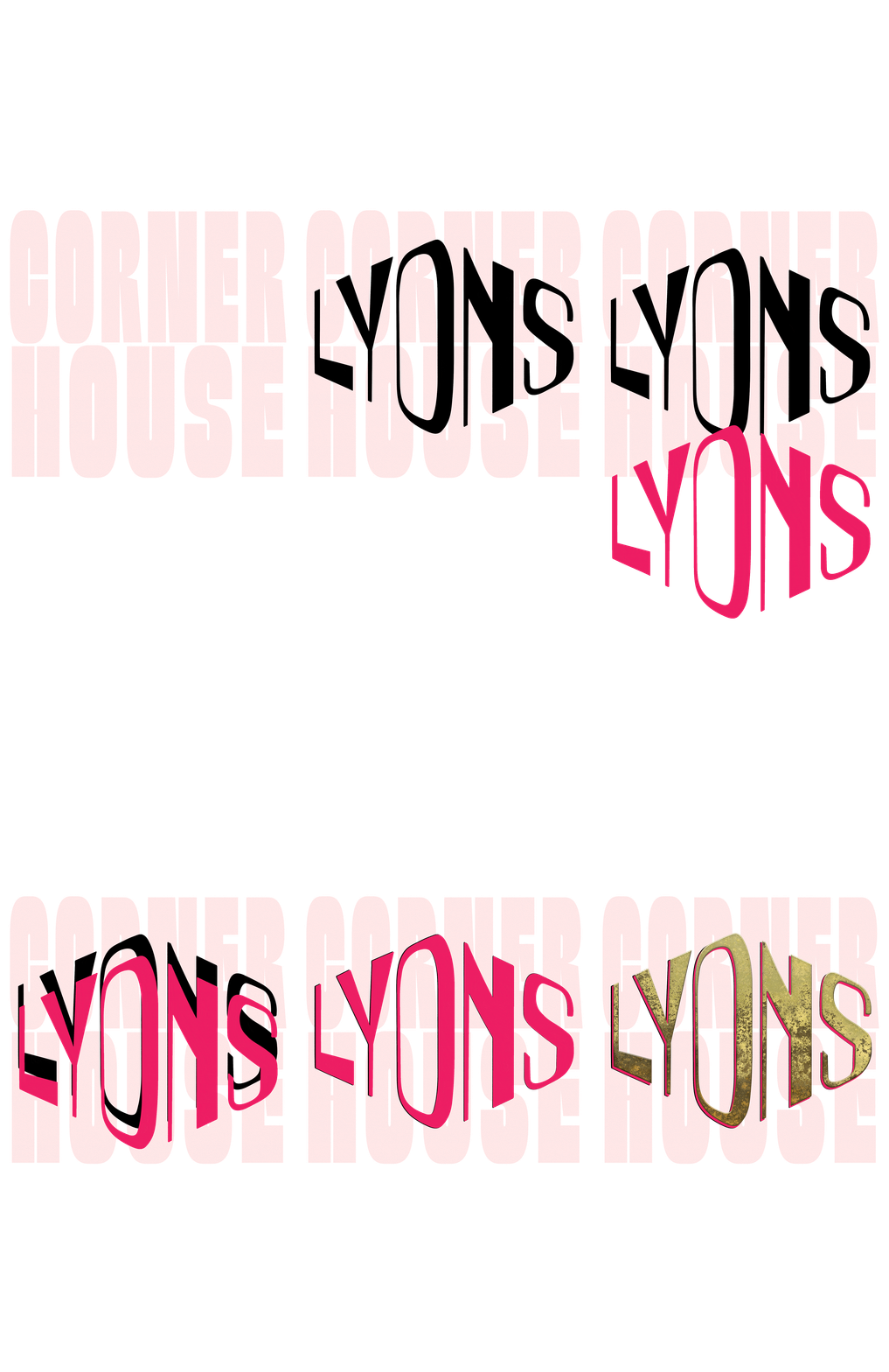
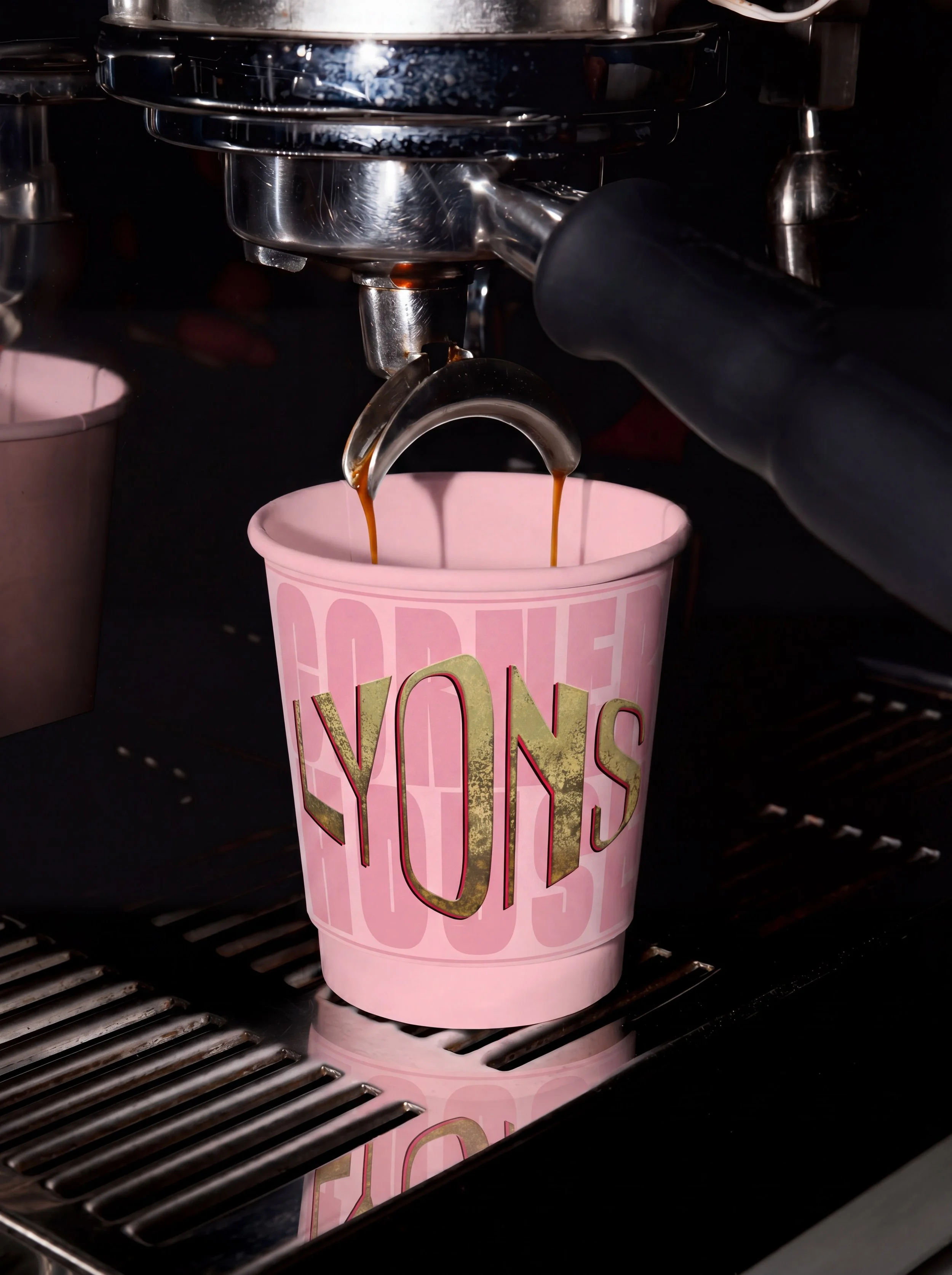
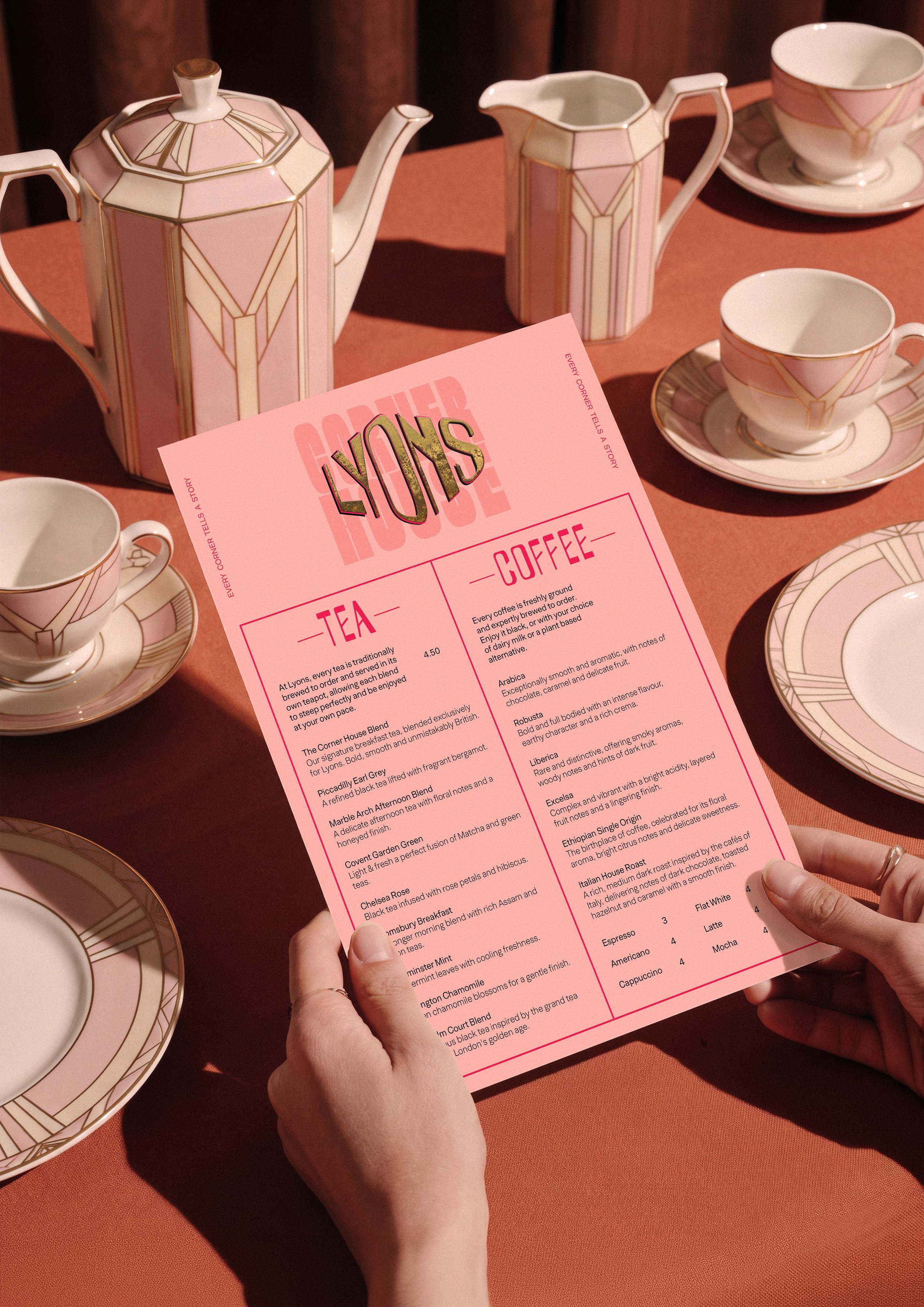
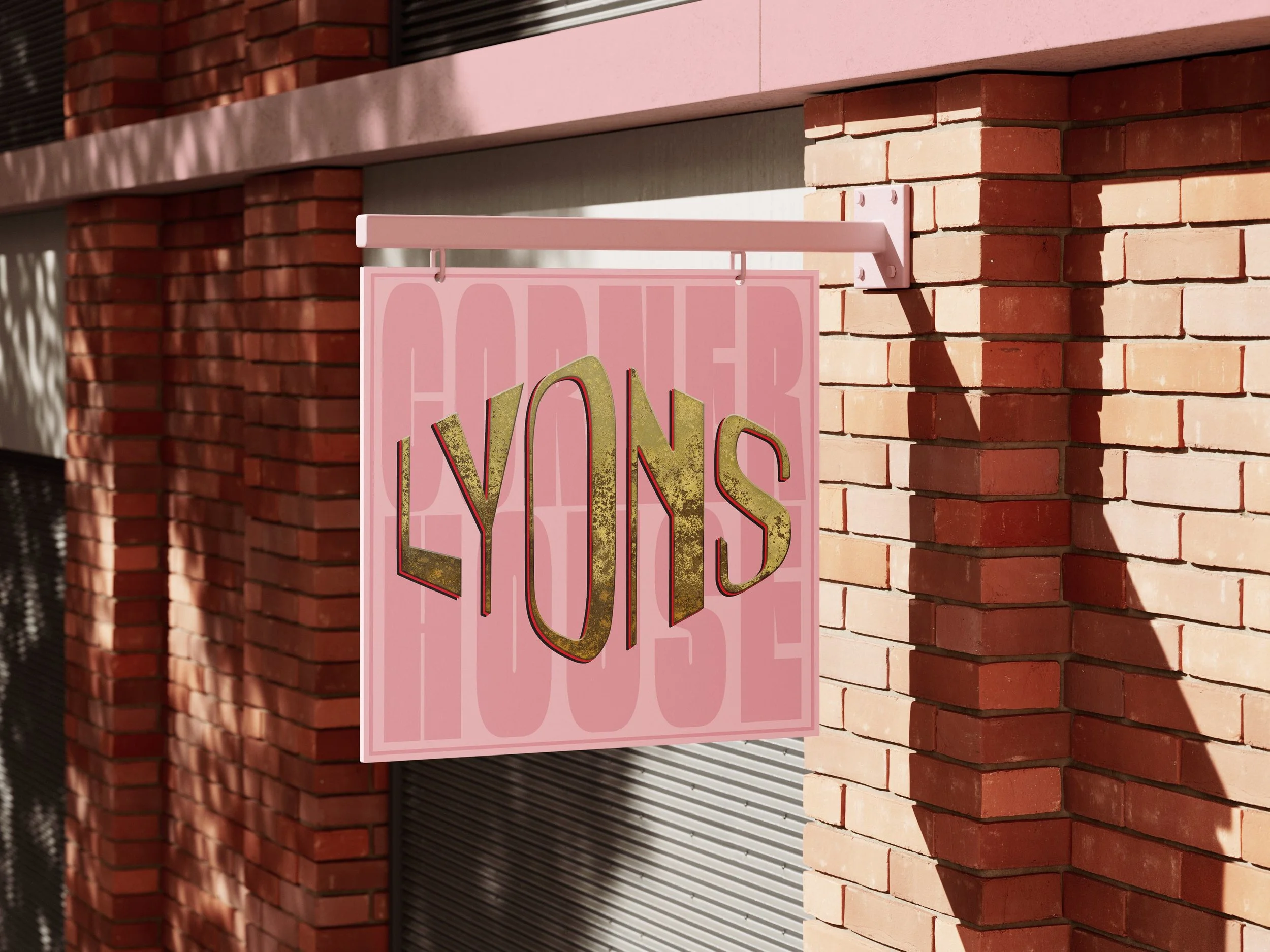
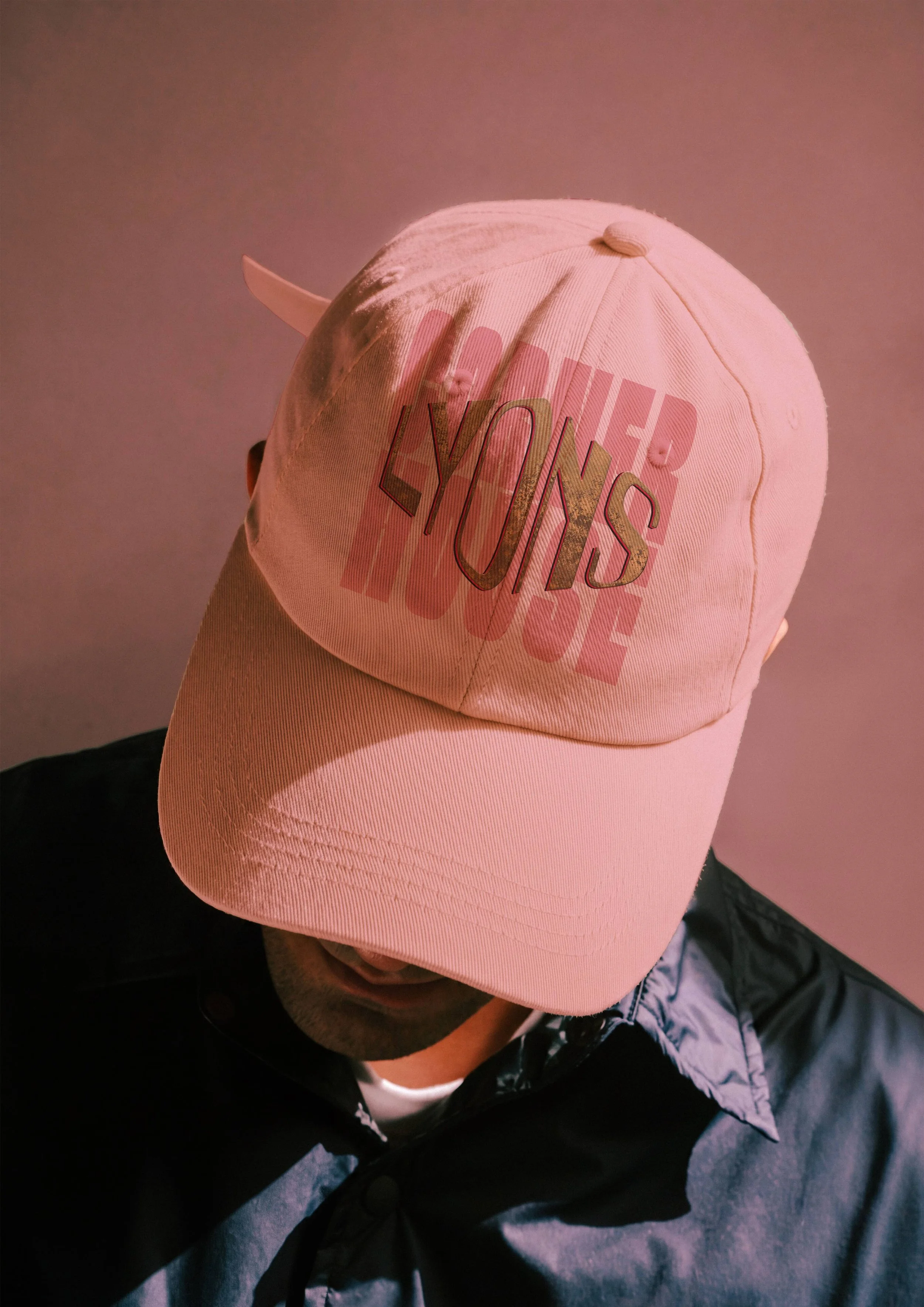
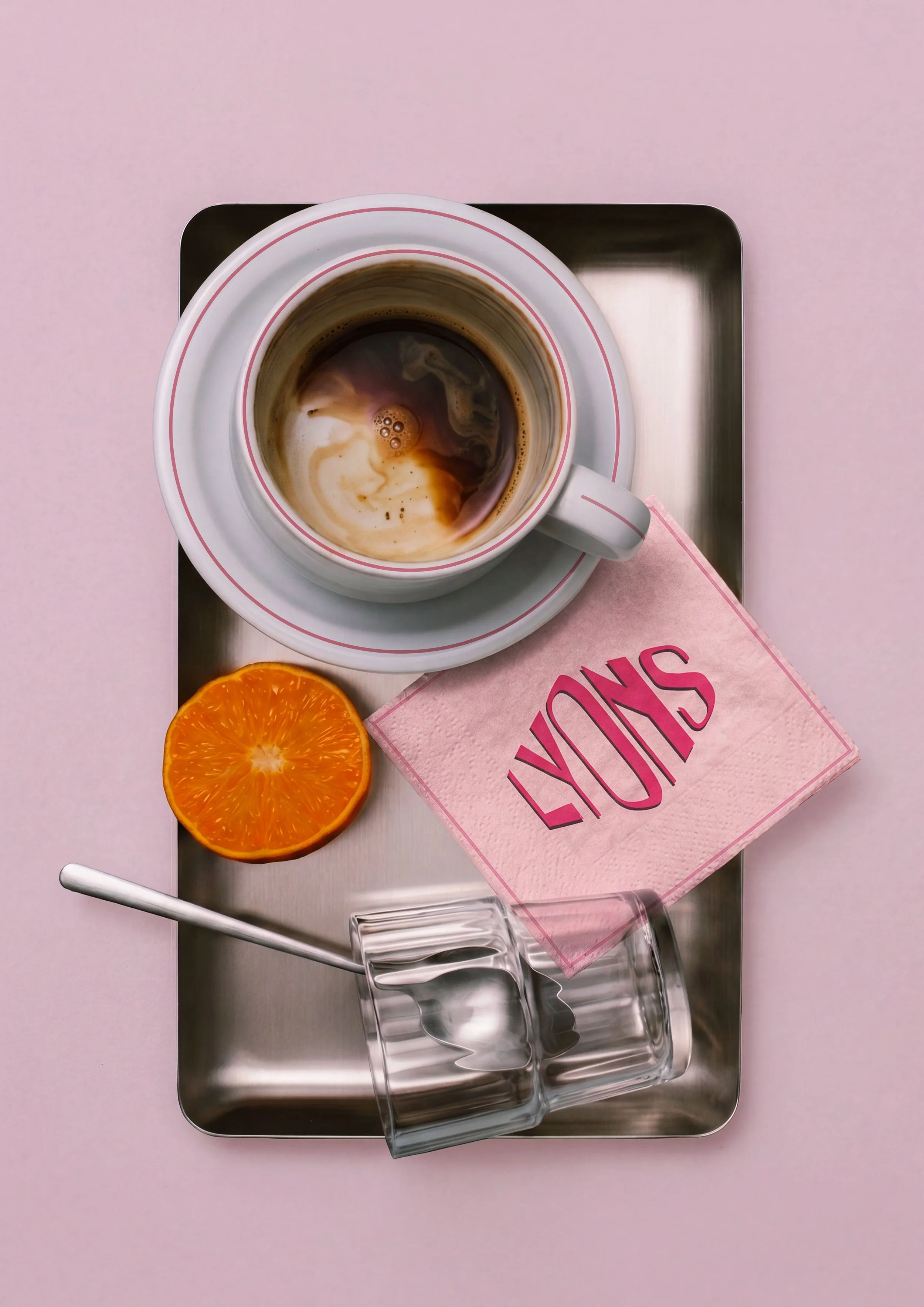
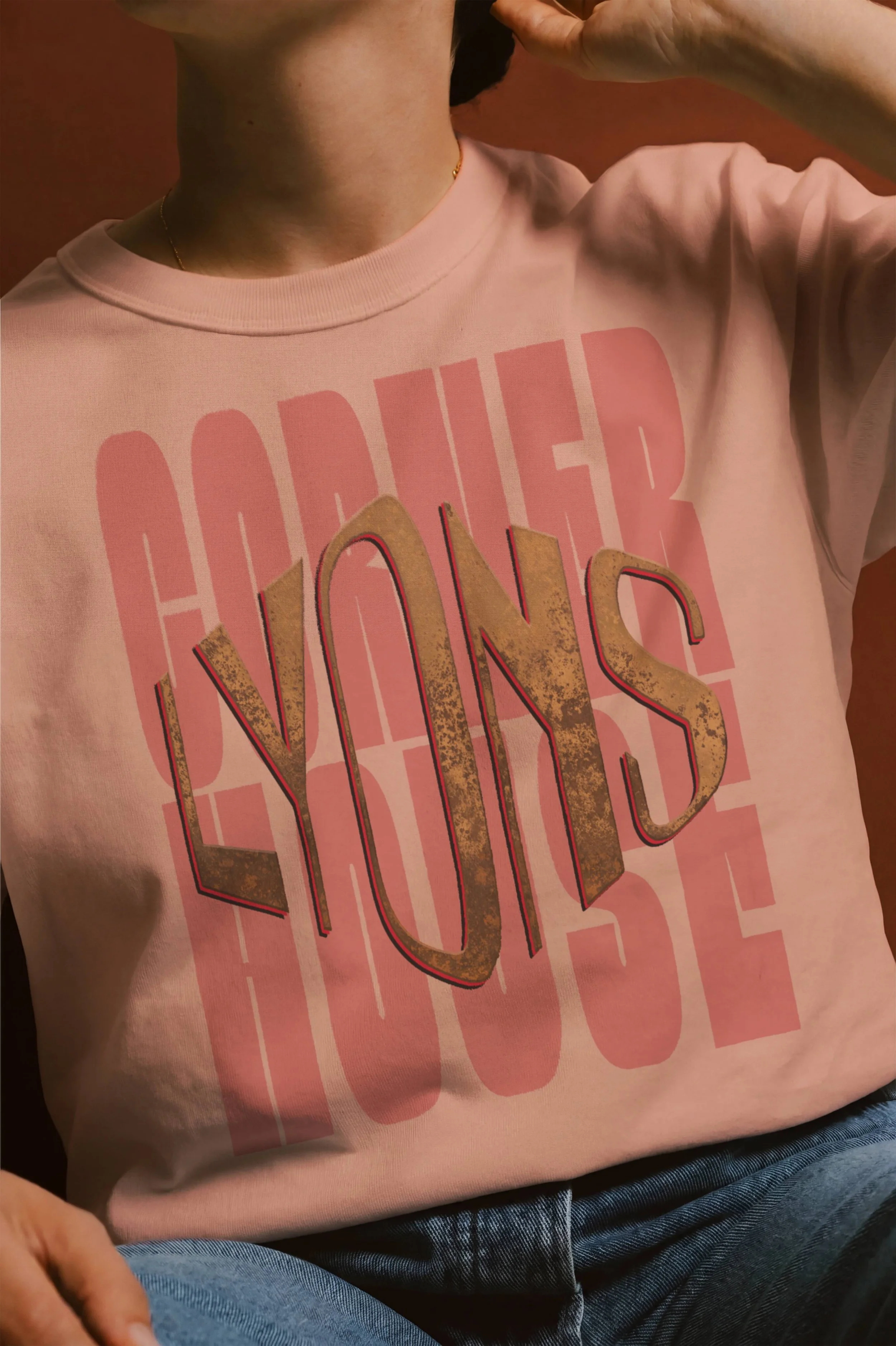
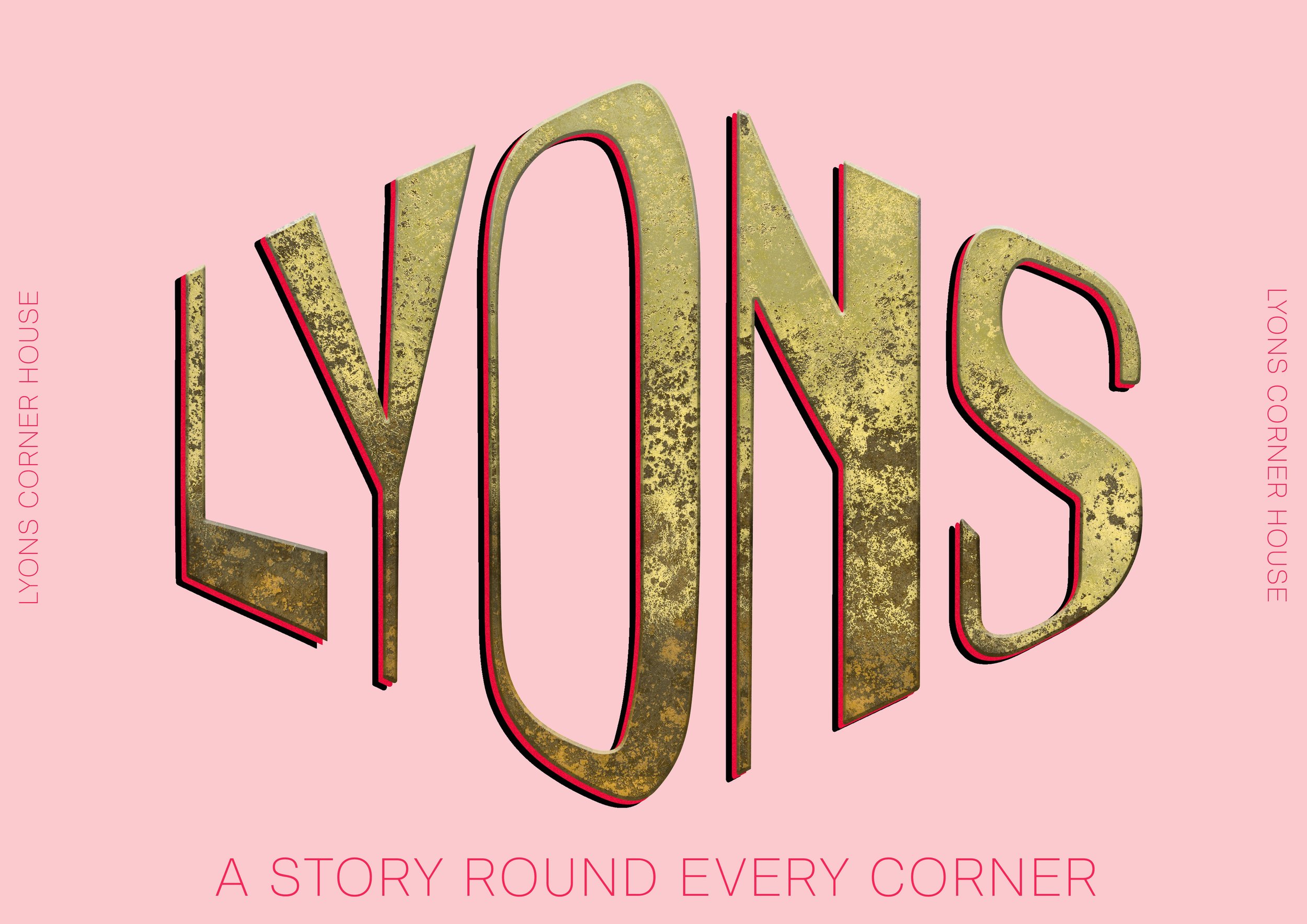
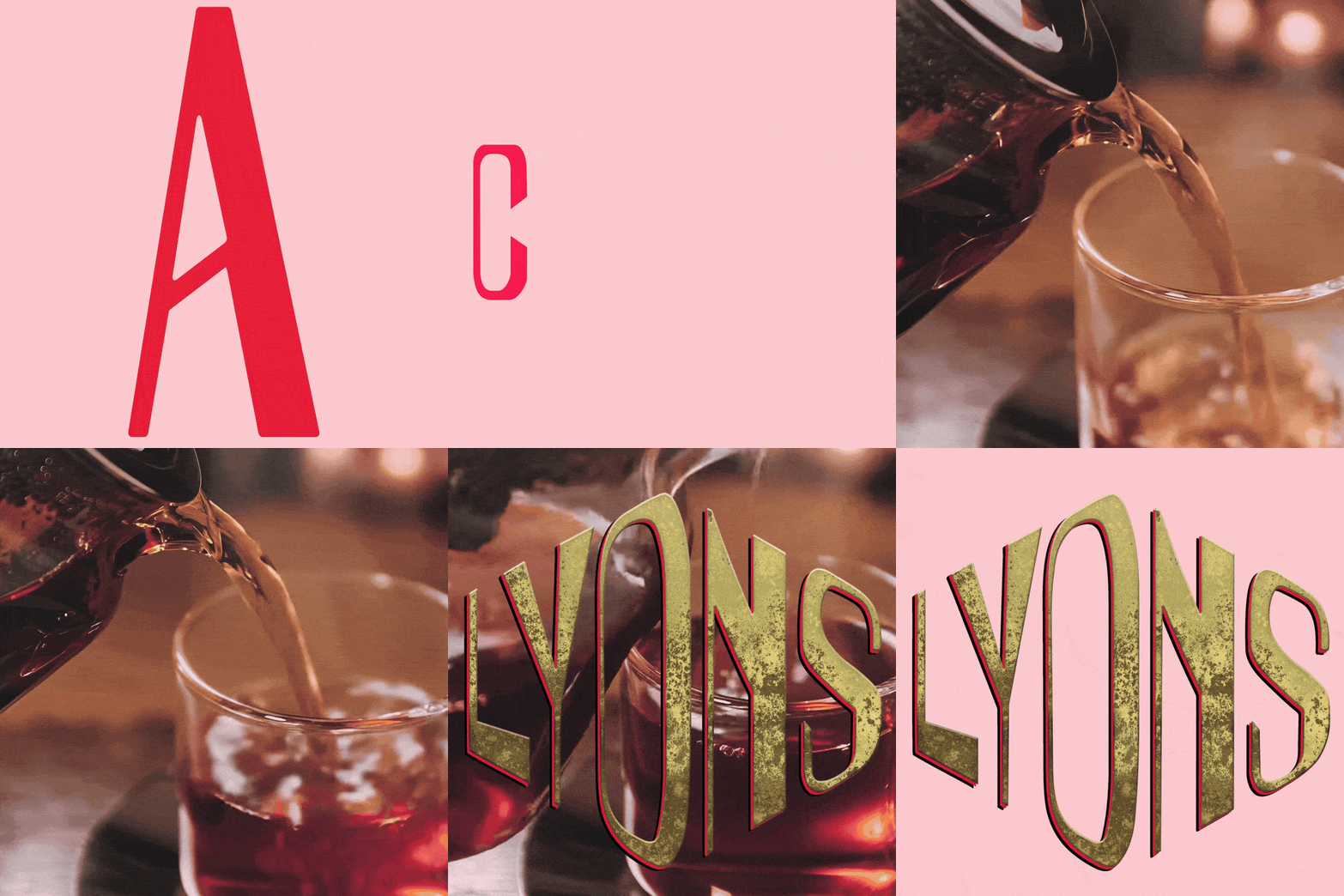
A custom logo was developed by combining a bespoke Art Deco inspired Lyons typeface with a clean sans serif, balancing historic character with a modern aesthetic. The result is a distinctive identity that feels both timeless and relevant.
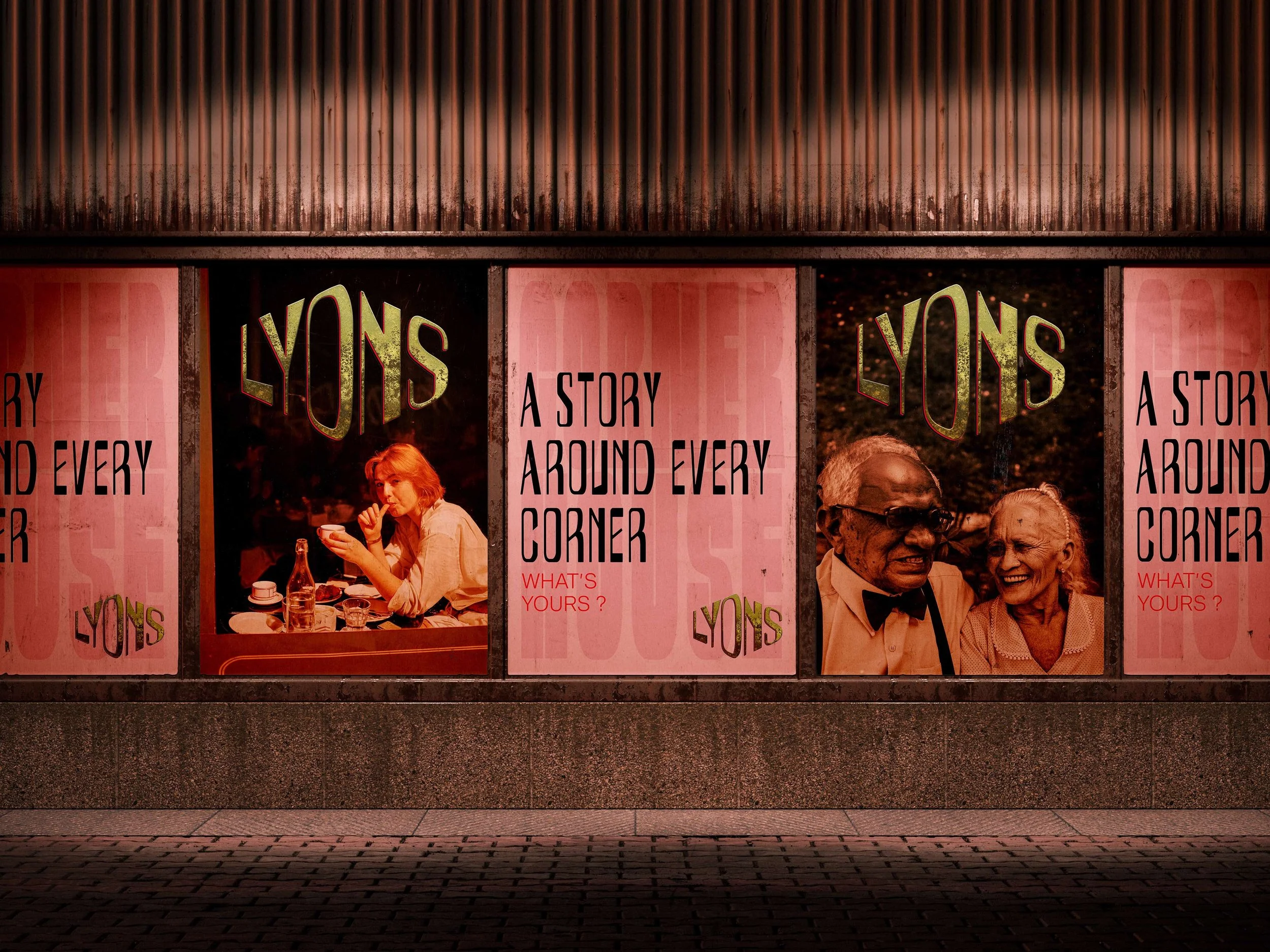
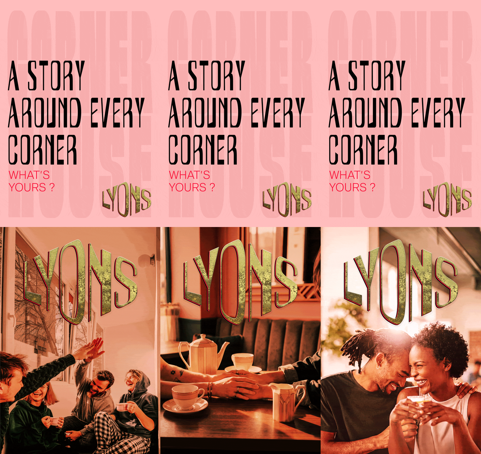
The campaign celebrates Lyons’ rich heritage while reimagining the brand for a contemporary audience. Centred around the tagline “A Story Around Every Corner,” it references the iconic Lyons Corner Houses, connecting nostalgic memories with new experiences to position the brand as both timeless and relevant.
A custom typeface, designed specifically for the campaign, creates a cohesive visual identity across all touch points, balancing heritage with a modern aesthetic. The messaging is intentionally simple and adaptable, allowing the concept to extend seamlessly across posters, social media, and promotional materials, with each execution reinforcing the idea that every experience becomes part of the Lyons story.

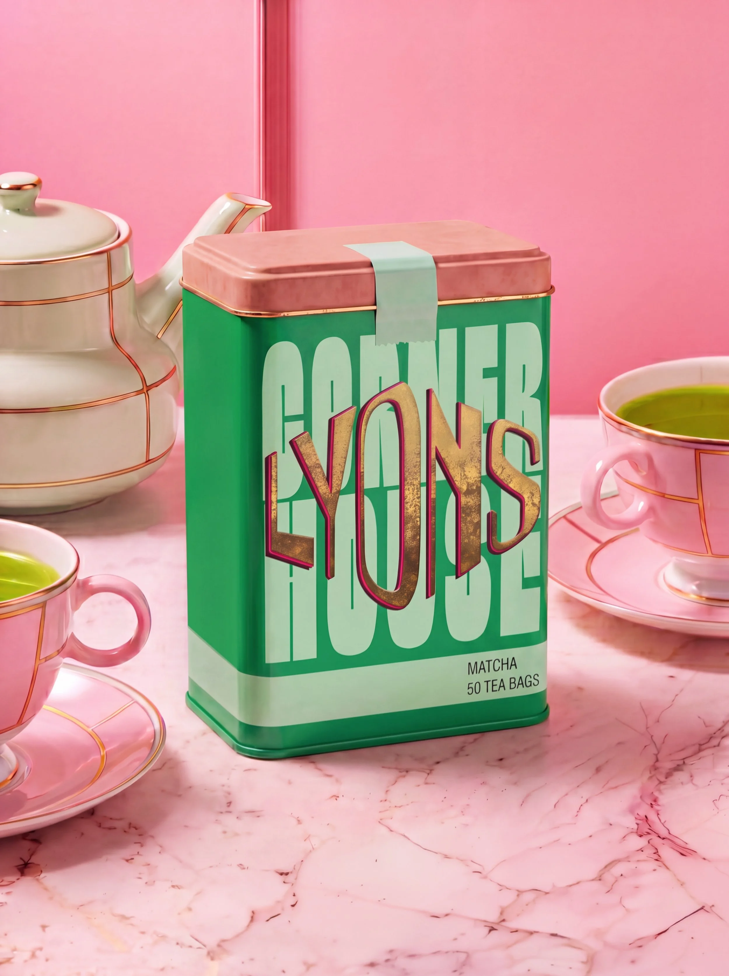
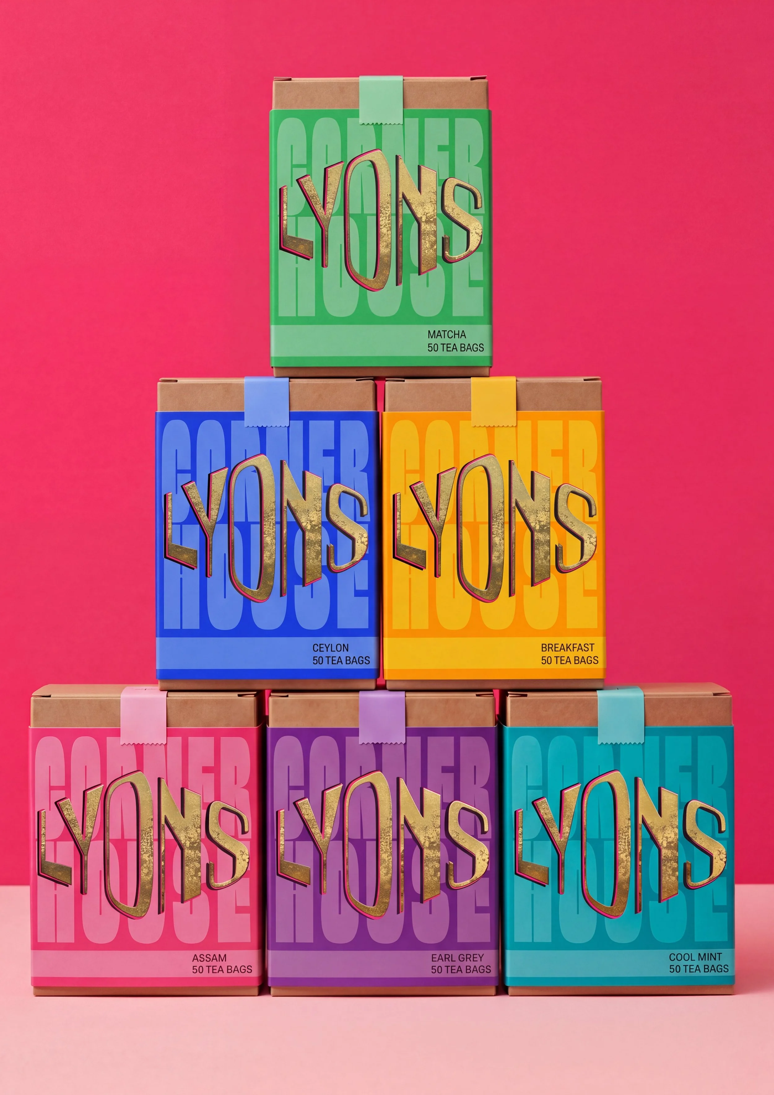
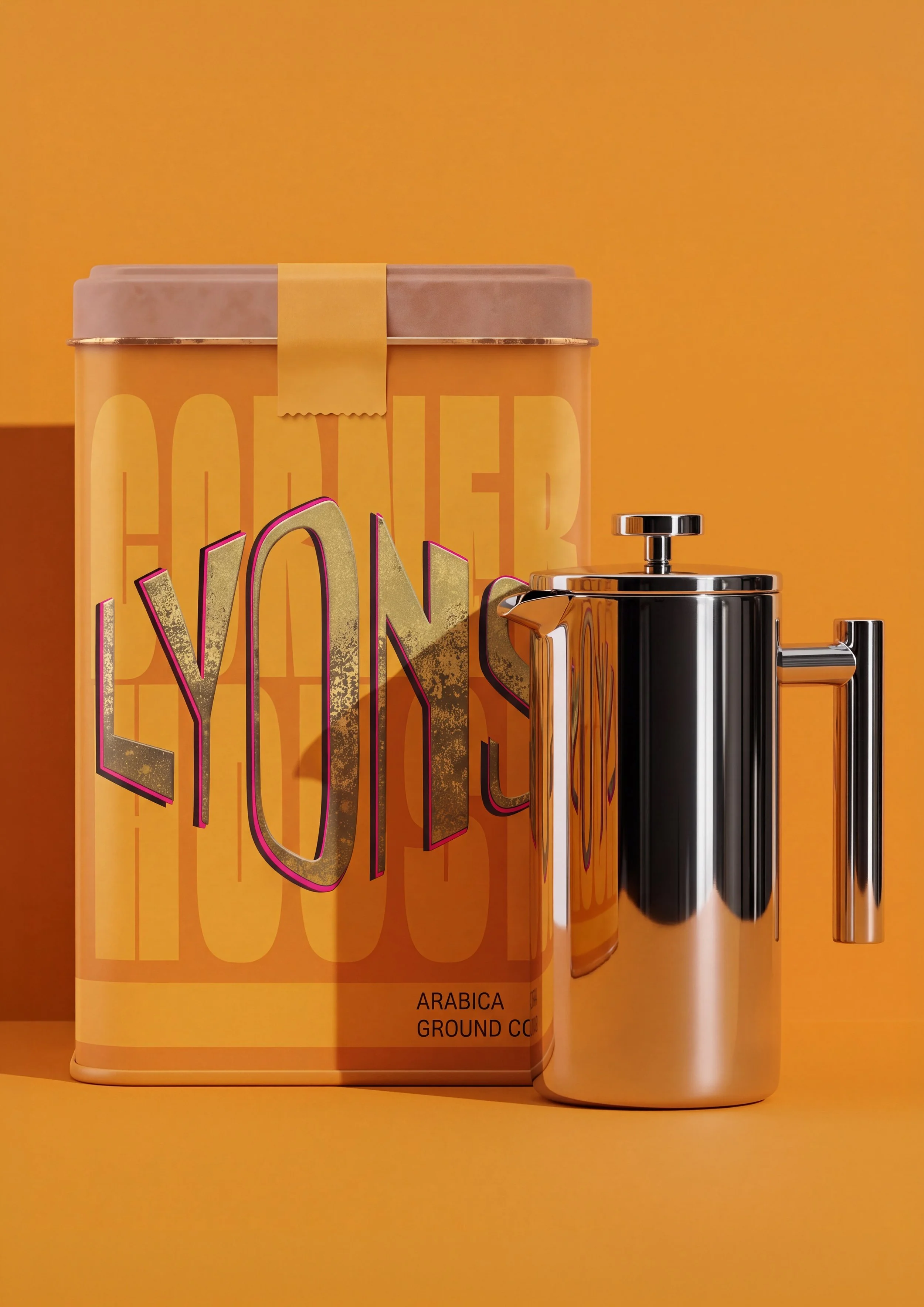
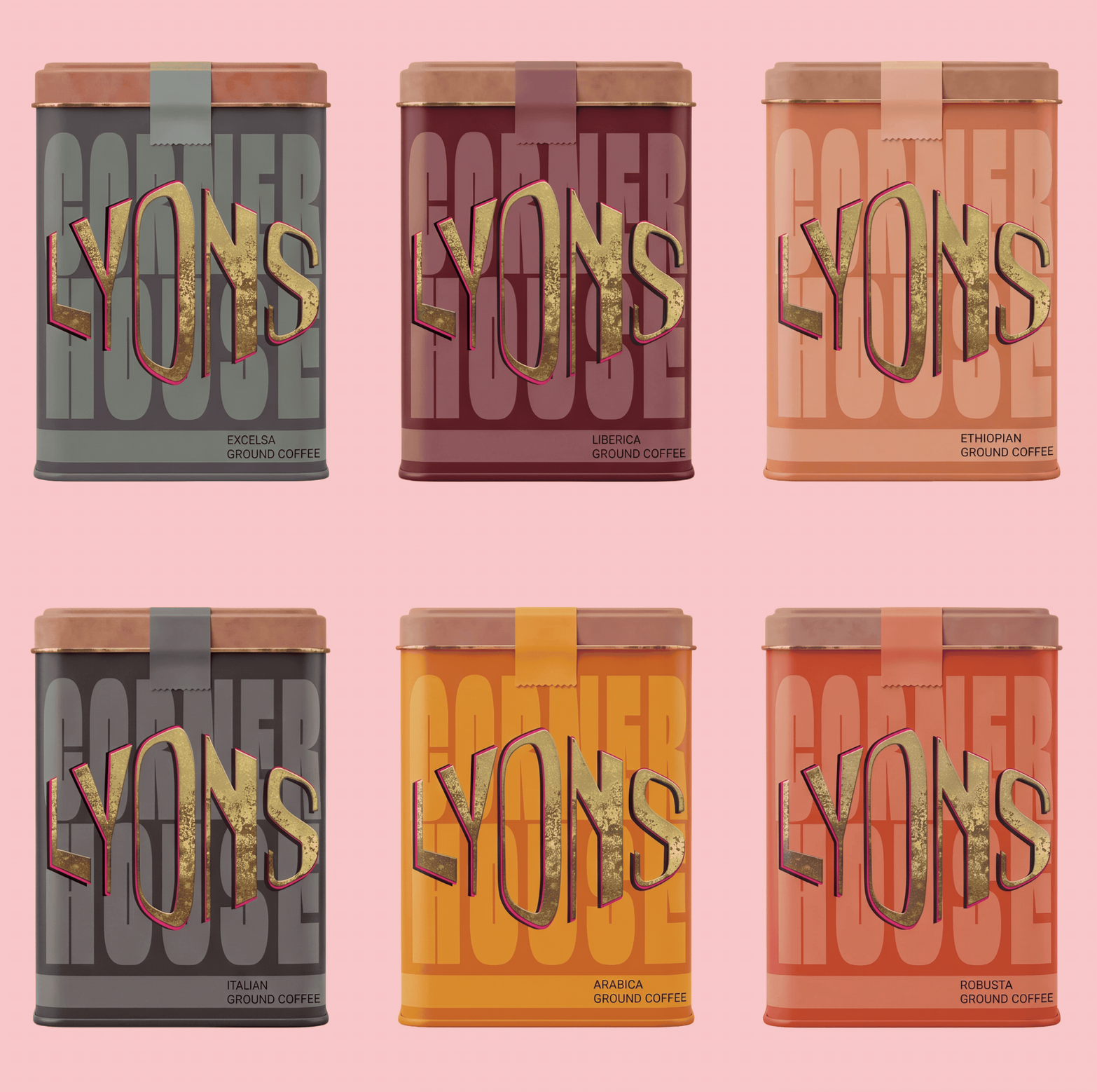
The packaging was designed with the same level of consideration as the visual identity, ensuring consistency across the brand. A carefully selected colour palette complements the identity while clearly distinguishing each product, creating packaging that is both visually cohesive and easy to navigate.